
DoorDash HealthCenter
App Feature
Design Challenge
client
DoorDash X Adobe Fall 2023 Designathon
project year
2023
role
Head UX / UI Designer
responsibilities
User Research, Wireframing, Prototyping, Usability Testing
context
The DoorDash HealthCenter is an add-on feature to the DoorDash app that helps users prioritize and manage their health. This project was created as part of the 2023 Designathon hosted by Design@Berkeley and UX@Berkeley in partnership with Adobe and Doordash.
problem
How might we design an engaging and efficient way for college students to promote healthy eating habits and practices to help them take better care of their health?
solution
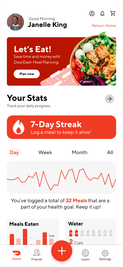
I designed a dual-pathway user experience that offers features such as meal-tracking, incentives for eating healthier, and more to help college students better prioritize their health.


problem
How can we get college students to eat healthier within tight budgets and busy schedules?
DoorDash's mission is to revolutionize the food delivery service by providing a convenient and health-conscious experience for all users, especially college students. They aim to promote food transparency through features like clear nutritional information, meal recommendations, balanced options, calorie tracking, meal planning tools, and affordable healthy choices. However college students still struggle to eat healthy due to limited options, busy schedules, and tight budgets. Our mission was to design an experience for users that would help them better take care of their health.

user research
Why are students struggling to eat healthy, when so many options exists?
For this project, research involved examining the existing nutrition and health apps currently on the market, as well as conducting a survey of college students on similar topics. Through the analysis of app reviews and public discussion boards, I was able to hone in on the strengths and weaknesses present in existing apps and the features users desired to enhance user experience. A key area of focus during this phase was identifying patterns in the eating habits of college students in order to identify the pain points experienced when trying to maintain healthy eating practices.


ideation
What solutions exist and why are they falling short?
In the current age, hundreds, if not thousands of apps and resources exist all claiming to solve the same problem. However, college students still struggle to maintain healthy eating practices. To gain a more cohesive understanding of the current market, I examined four well-known apps in the health space to see what users were praising and what they wished was different.
Competitor Analysis

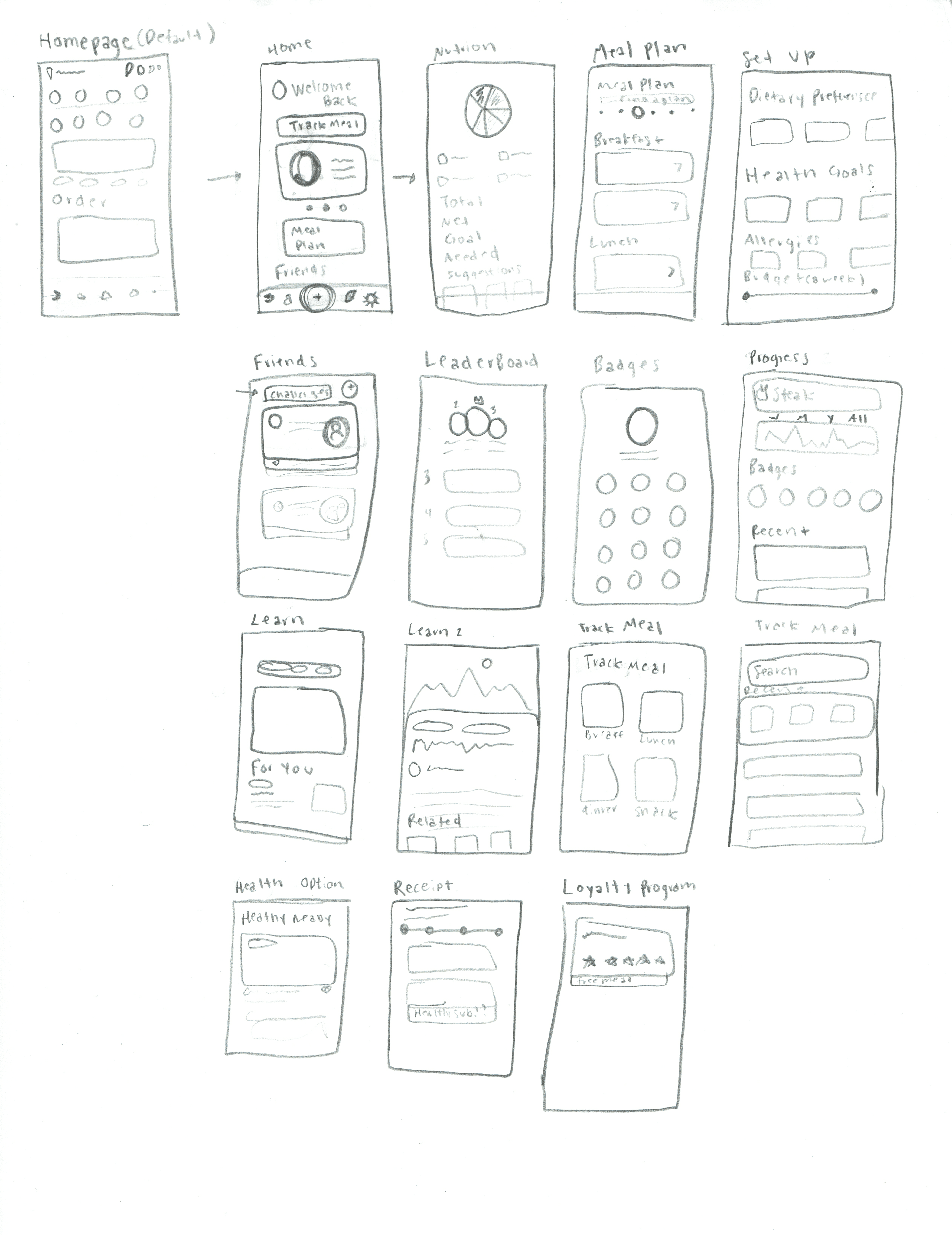
Sketches

Testing
Low-Fidelity Wireframes
Within the timeframe of the Designathon, as a team, we were able to create mid-fi designs for each of the planned screens and a limited number of high-fidelity prototypes. We presented our designs and received feedback from a panel of judges with backgrounds in product design and user experience at Adobe, DoorDash, and more. Beyond these wireframes are additions that I made to the project on my own time.

testing
Direction
Following Usability Studies of the initial prototype, my main focus for improving the design were the following:
1. Make the Meal Tracking Aspect More Prominent
Users noted that although it seemed the purpose of the health center was to keep track of one's eating habits by logging meals, the design’s hierarchy did not reflect this goal. A few users also noted that there should be more transitions to the typical DoorDash user flow and more opportunities for users to order food through the Health Center.
Replace Calorie Tracking with a Healthier Alternative
In both the survey and usability study, many indicated their hesitation to use calorie-tracking apps due to the fear of becoming obsessive and developing eating disorders. To address this, I researched alternative ways to keep track of meals without relying on calorie tracking. Tracking the number of meals and trying to include different major food groups was proven to be a healthier alternative. This change allowed users to set specific goals such as "eat 20g of protein every day" or "only eat 100g of carbs a day", which the app could find and suggest meals for users who haven't reached their daily goals yet.

Increase Incentives/User Buy-In
Another piece of feedback that I received is that for users to use these features more consistently throughout the week, there had to be stronger incentives. Based on this I further developed the rewards and social features of the app, allowing users to earn badges, share their progress with friends, and most importantly, work towards deals and discounts, making eating healthier more affordable.
solution
Updated User Pathway
For the Finalized User Pathway, the user experience focused on two separate methods of interacting with the added features, the first being through features that add on, but do not disrupt the traditional DoorDash User Experience, and a separate Health Center users would have access to more personalized features.

Low-Fidelity Prototype
The Low-Fidelity prototype focused on how users would move through the DoorDash Health Center, as well as the additional features they would have access to. The goal was to create an engaging user experienced that offered more than simple meal tracking.


High-Fidelity Prototype
Taking insight from the initial usability studies and feedback from user surveys, the main goals for the high-fidelity prototype were to make the meal-tracking aspect of the app more prominent, replace the calorie tracking aspect of the app, and address the lack of buy-in incentives for users.

impact
Intended Contribution
I hope that through the design and user experience of the added features, college students will be able to learn more about healthy eating practices and develop routines they can implement in their future eating habits.
By adding goals and rewards, and designing a space for peers to interact with each other within the app, I hope to create an experience that is engaging and appealing to college students, without having to lower levels of accessibility.

reflection
Lessons Learned
1. The Design Process is Unique to Each Individual Project
A key takeaway I've learned from this experience is that every design project is unique and will require a different approach. I went into the project thinking that the only way I would be able to create a meaningful experience was if I made sure to follow a set linear pattern of design exercises. However, in trying to produce all of these things, I wasted time that could've been used to produce more polished mid-fidelity deliverables for the final product.
2. Designing within the Constraints of an Existing Brand
A challenge that this project presented was creating a feature for an app that already has its own defined style and brand kit. As the project went on, I realized how much time I saved at points where I usually spent a lot of time and energy trying to pick the perfect font or color palette. Through this experience, I was able to gain experience creating novel interfaces, that when placed alongside existing designs, would fit right in.
3. Quality over Quantity
For the Designathon we were given at least 12 areas of focus, to address in our design. In our attempt to satisfy all of these areas, we brainstormed a large number of features that we ultimately were not able to implement. If I were to go back, choosing a limited number of areas to focus on and making sure that those features were completely developed before moving on to addressing other needs would have been the most efficient route.

next steps
Moving Forward
1. Address Remaining Accessibility Needs
When further developing the mockup, I would continue to add features that address accessibility needs. Planned additions include adding a dark and high contrast mode for users, adding voice navigation controls and image captions, and making the designs compatible with screen readers and other assistive technologies.
2. Refine Rewards Aspect
I also plan to refine the rewards aspect of the app and design interactions that show the ways users can earn savings and coupons through eating healthier.
3. Further Research Healthy Gamification
I have also begun to further research ways to “gamify” the process and give users more incentive to continue using the health center on DoorDash to make healthier eating choices and return to the app frequently.
Selected Works
Join the Newsletter
Stay up to date on my latest updates, design resources and more!
© 2026 Jalen Gooch Creative Co.